
The living room – or parlor, if you want to sound fancy – use to be horrendous. Literally, clutch your children close & shield their eyes because it’ll probably scar them for life awful.

Blue, red, and yellow with laminate floors {as of course all the previous occupant’s stuff}.
While the floors were refinished, it didn’t look that much better after we moved in.

But slowly, over the past several months, thing are starting to improve.
Painting made the most dramatic difference. {We’re still ignoring the primed-only ceiling, m’kay?}
The BONDE cabinets lightened up too and now wear sparkly new-old hardware.
And of course there was the whole couch debacle that turned into an unexpectedly large project.
The living room is by no means done but there were requests to see some wide-angle shots.
Here’s what things are looking like as of last night –

Not done, by any means. But certainly leaps & bounds better from that BLUE AND RED {!!!!!!!!} combo.

The BONDE cabinets really do seem lighter & smaller visually now that they’re the same as the wall color.

The two chairs have been around forever. Found the leggy one at a yard sale in college. I wish I remembered how much I paid for it.
That table in between the chairs was found on the side of the road last summer. The top folds down, which I thought was cool.


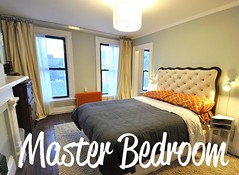
The walls are Sea Pearl, by Benjamin Moore. I think the photo below shows it most accurately it. It’s a grayish beige. {Rambling Renovators used it in their master bedroom, if you want to see it in another space.}

You might also notice that “basket” above isn’t really a basket. It’s the lampshade that came with the amber glass lamp!
The mirror behind it isn’t staying. Picked that up at a yard sale a couple weeks ago for $0.80.

One day, that large blank wall will be home to all my doll molds. For now, Da Vinci the yellow metal bird chills there. Thinking he might look good in the garden. Or maybe the office if that ever gets painted.

Above is another decent shot of the wall color. It’s a very good off-white. Light but it looks like a color when paired with white-white trim {stock white Behr semi-gloss}.

After looking at these photos, I think it’s blatantly obvious how much this room desperately needs some color. Things swung from color-overload with the red/blue/yellow to almost completely neutral. The “After” lies somewhere in between.


YAY Progress!!


It looks fantastic!
This is SUCH an inspiration. My fiance actually asked me to take a look at a house that needs A LOT of work and I started thinking about your place. I don’t know if I can handle it…but the price is totally astonishing. Hm. Hm. More hm.
It’s probably more work than you imagine {even if you’re imagining it to be a crap-ton of work}. But if you LOVE the space, location, and the idea of what it could be, go for it.
I truly don’t mind living in the chaos. Growing up, I don’t ever remember living in a 100% DONE house. My parents were constantly working on something; still are. I think that has actually slowed down the renovation here. Because I’m so comfortable with living in the in-between, things happen slowly. I like the process almost more than having everything finished {almost!}. The finished product is truly worth all the effort! I’d love to see your potential space! Send over the MLS listing (brickcitylove at gmail dot com). 🙂
The room looks fucking AWESOME! Good job. It is so beautiful!
THANK YOU!!!
Worlds better! That blue red combo was horrendous! lol. But I think it helps you appreciate your home more, now that you have been able to put your own stamp on it.
I honestly cannot belive the blue & red & yellow stuck around for so long. It’s WORLDS easier on the eyes now.
Holy COW that’s beautiful! You’ve done an amazing job. I can tell that you feel that it looks unfinished and maybe a little too color-neutral for your tastes, but the space is GORGEOUS. I think you have a beautiful space as is, and it’s bound to only getter better with time.
Wow that looks gorgeous! I’ve been following your blog for a while but I didn’t remember those horrible before pictures! What were they thinking painting it like a fun house? So glad you are taking the time to restore this beauty. Keep up the good work!
Wow – what a huge difference! I’m in love with the color of the room, its so delicate and looks amazing! 🙂
I love it! It looks so elegant. Great job.
Wow! I can hardly believe it’s the same room. What character your home has – that woodwork! That fireplace! Those high ceilings! It’s just lovely and so calming now.
What a transformation! Looks awesome! The room has great details, love the moulding, trim and fireplace!
looks BEAUTIFUL, carrie- can’t wait to see the rest of the rooms when they are done and this one with more color/dolls
love it!!
Amazing transformation. It is so relaxing now and makes you want to stay awhile:)
the side by side comparisons at the end are very needed, cause otherwise i wouldn’t believe it was the same room – what a great transformation!
Please excuse me if this is staring right at me (I’ve been accused of being blind before…), but where is that wonderful rug from? 🙂
I actually got that on Gilt
Pingback: On Re-Nest! |
Just stumbled upon your blog for the first time. I adore all the details in your house, can’t wait to follow as it all comes together!
Hi Carrie,
Wow! What a rad house, and what a lot of progress you’ve already made. I love the improvements in the living room and can’t wait to see what you guys do next.
Good luck!
Christina
Thanks so much for your before and after pictures – you do a great job at getting the same angle so it’s easier to appreciate the difference…
I realize this is 3+ years later, but I just found your blog and am loving it!
Greeat blog you have here